
5 COMMON MISTAKES WHEN DESIGNING A LOGO
Mistake #1: Raster Graphics
A Raster Graphic is resolution dependant, meaning that if said graphic needs to be scaled up, the pixels blow up and you are left with something like this…
![]()
Seeing as we are now living in the mobile world, it’s more crucial than ever to make sure logos scale properly to their host device or application. Logos need to be at a consistent quality no matter the platform, with no pixelation issues. This is why raster graphics are not ideal.
It is not the standard any more to use bitmaps, use vector graphics, which scale nicely because they don’t use pixels.
Mistake #2: Following Trends
Design goes through fads just like fashion. A logo needs to last you more than a couple years.

![]()
Everything was covered with layers of fake-gloss effects in 2006. Do not let a logo date your business to a specific time. Classic and Timeless is the name of the game.
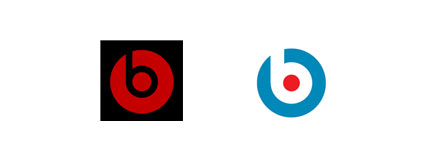
Mistake #3: Mimicking Pre-Existing Logo
Copying a pre-existing logo hurts the client and the designer. You may find yourself in court. Copying a design makes the designer look lazy and willing to coast on the success of others. Be unique!
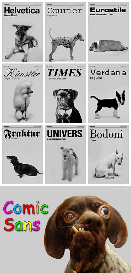
Mistake #4: Illegible or Just Plain Ugly Typefaces
Typefaces have personality. A lot of logos rely on just typography to represent themselves. Make sure the font you choose best represents you and your message. Do not use more than one or two different fonts in a logo or it can get complicated and messy.
Mistake #5: Over-complicating
Our eyes are sensitive. You want your logo to be appealing and eye catching but it doesn’t need bells and whistles. Keep it simple and interesting. Also remember that a logo goes on a lot of different things. If your logo has too much detail, it will look like a blob if printed small scale.